Table of Contents
A startup born from its founders’ longing for every person to see beyond the stories, challenges and constraints that hold them back.
Whilst only a small part of the retina, the fovia (pronounced “foh-via”) is the region of clearest vision and greatest resolution. As a faith-based community, Fovea is an open platform that shares created and curated content—including new insights, tools and resources—to help people see what is possible in their lives.
With the support of long-term collaborators The Brand Language Studio, I worked with Fovea to define the brand’s essence, audience and positioning; before crafting both its visual identity (how it looks) and verbal identity (how it sounds). Foundations in place, I devised Fovea’s marketing strategy and digital assets to help it launch.
Brand strategy
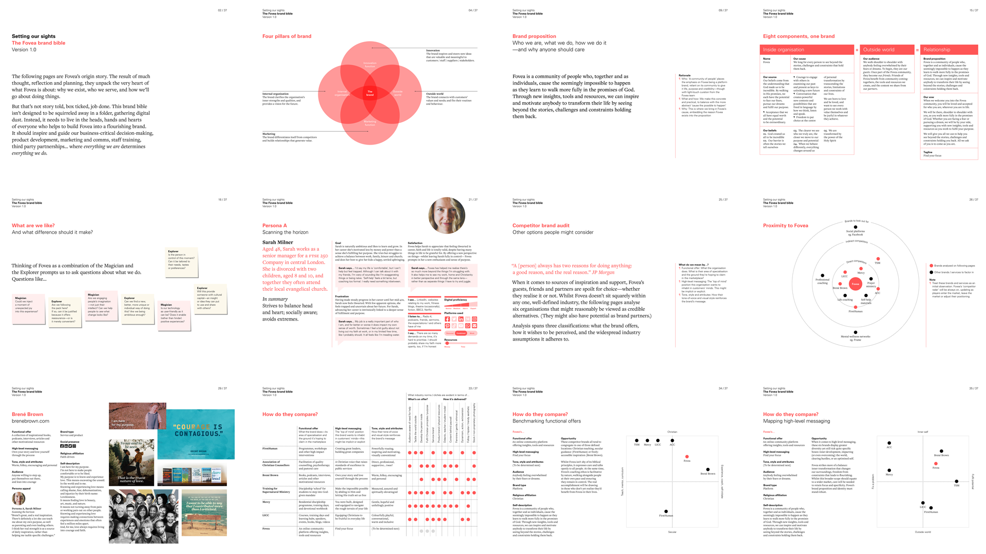
A combination of immersive thought, reflection and planning unpacked the very heart of what Fovea is about. This origin story was captured in a brand bible to inspire and guide business-critical decision-making, product development, marketing and comms, staff training, third party partnerships… to ensure everything they are determines everything they do.
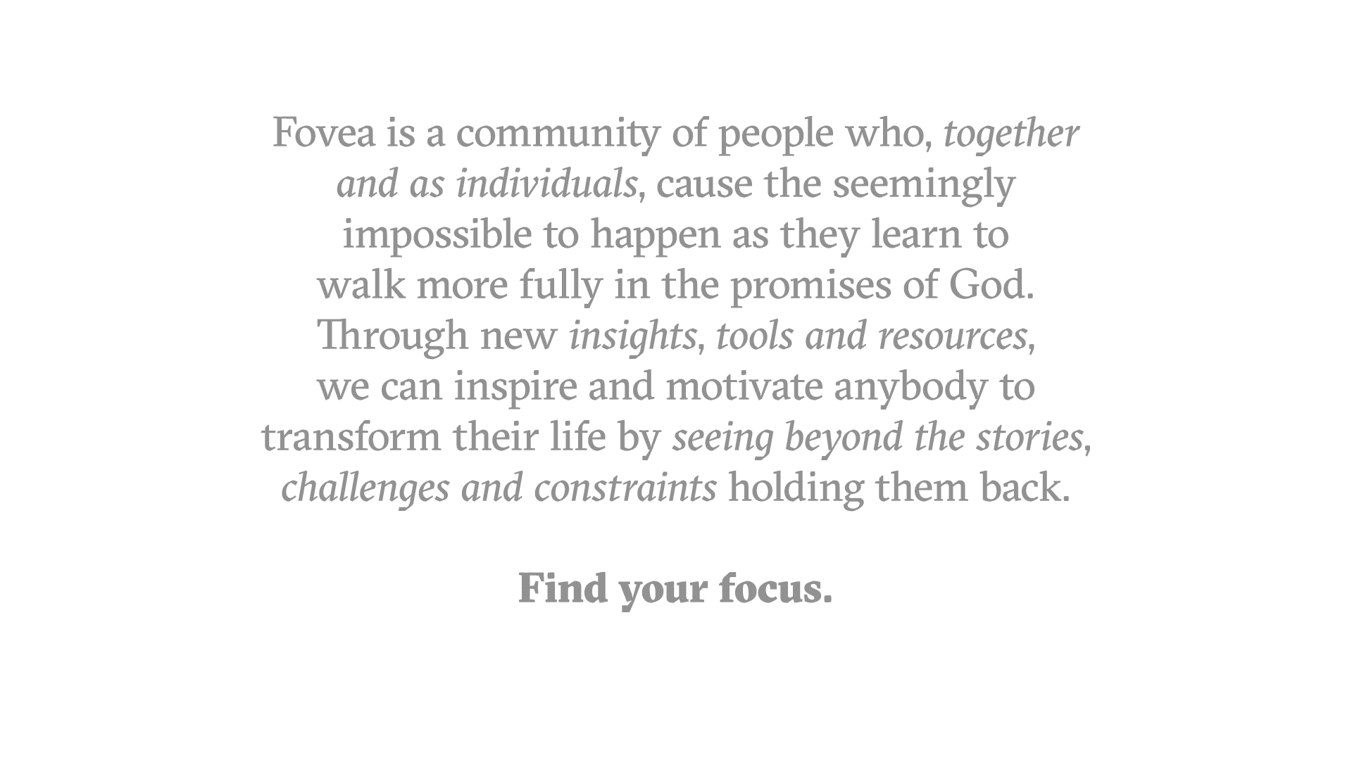
Fovea’s brand proposition summarises why they exist, the value they bring, and the people they serve:
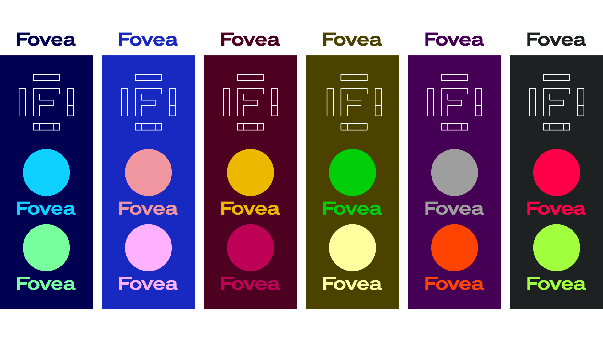
Brand identity

Orthographic projection is a method of presenting all elevations of an object in one go. With Fovea encouraging people to see the familiar from a different perspective, it’s an apt visual technique to inspire the brand’s identity.


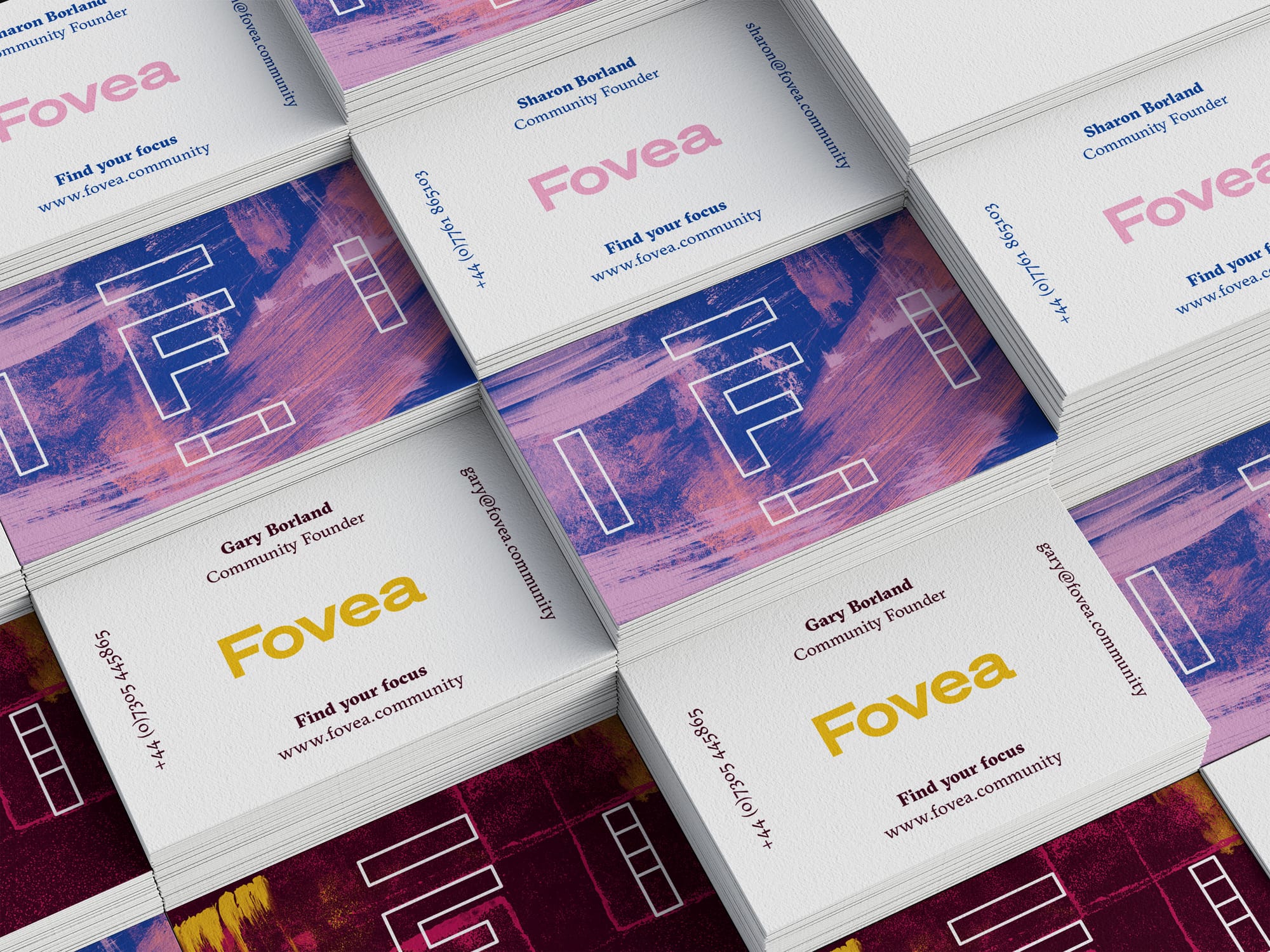
Serving as a visual device beyond the logo, the orthographic F—what Fovea calls its F-Frame—fills any space it inhabits. In contrast to the geometric accuracy of the F-Frame, a series of expressive backgrounds provides contrast, drama and a distinctly human presence.




Motion graphics
Primarily occupying the online space, it was only natural for Fovea to use motion to bring the orthographic concept to life. A series of motion graphics built by Vincenzo Marchese Ragona find their home on social media, in Fovea content, and as dynamic wallpaper within physical spaces.
Launch strategy and online presence
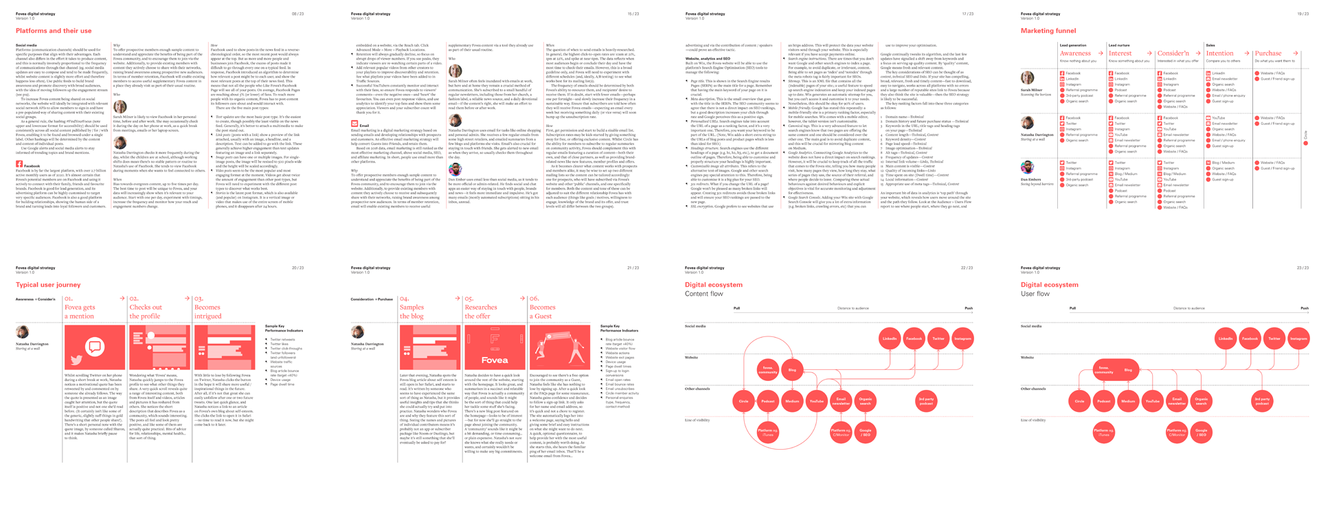
Starting with a digital strategy helped Fovea target the right people online, raise brand awareness, and prioritise limited resources. Acknowledging Fovea’s start-up status, the focus of the strategy was member acquisition and owned marketing channels. Widening its scope to support member retention, and to embrace earned and paid channels, would come in time.
Despite being built using an off-the-shelf web platform, I collaborated with a developer to semi-customise the structure, UX and UI of Fovea’s online ‘shop window.’



Project credits
Verbal identity lead Rob Self-Pierson
Animator Vincenzo Marchese Ragona
Web developer Philip Abbott


